
Planning your own picture book?
Get my free Picture Book Planning Kit — the spread planner, character reference sheet, and print templates I use on every book.
A title can also help shape a book’s illustration style. I struggled to find a title for my first book, Sunbelievable, before I had an illustration concept in mind. Then one afternoon, while waiting impatiently at a long red light, I looked up at the bright blue sky and the dominant sun. What a picture-perfect, “sunbelievable” sight, I thought. I knew immediately I’d found a perfect name. Trust your instincts.
Feeling is also conveyed through design and illustration together. Your choice of font styles and layouts, such as the arrangement of text and images on a single page or spread, are just as important in evoking emotion. Graphic design places and scales visual elements for best visual impact. Effective layouts help the eye flow across a page and through the book.
I've illustrated children's books for more than a decade, first in Photoshop layer by layer and now with a hybrid workflow. The question I hear most from first-time authors isn't "how do I draw?" It's "what should my book look like?" This guide walks through the most common children's book illustration styles, what each one does well, and how to choose the one that fits your story.
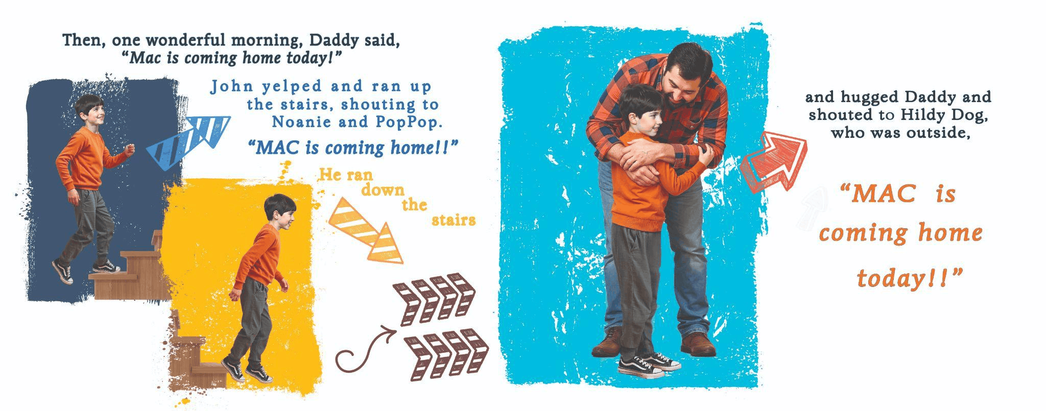
The style I’m best recognized for is Photorealistic, a blending of original photographs of people, objects, and scenery transformed by Photoshop into picture book illustrations: Sunbelievable and I Want Cake! Since 2023, I almost always work with a combination of AI and Photoshop. AI to explore styles, characters, and design. Photoshop for precise touchups and refinements, if needed: Welcome, MAC, to the Family! I’ve included examples of each method in the images throughout this article.
9 Children's Book Illustration Styles (and What Each One Does Best)
These aren't strict categories. Plenty of the books you love blend two or three of them. Think of them as starting points for a conversation about your story.
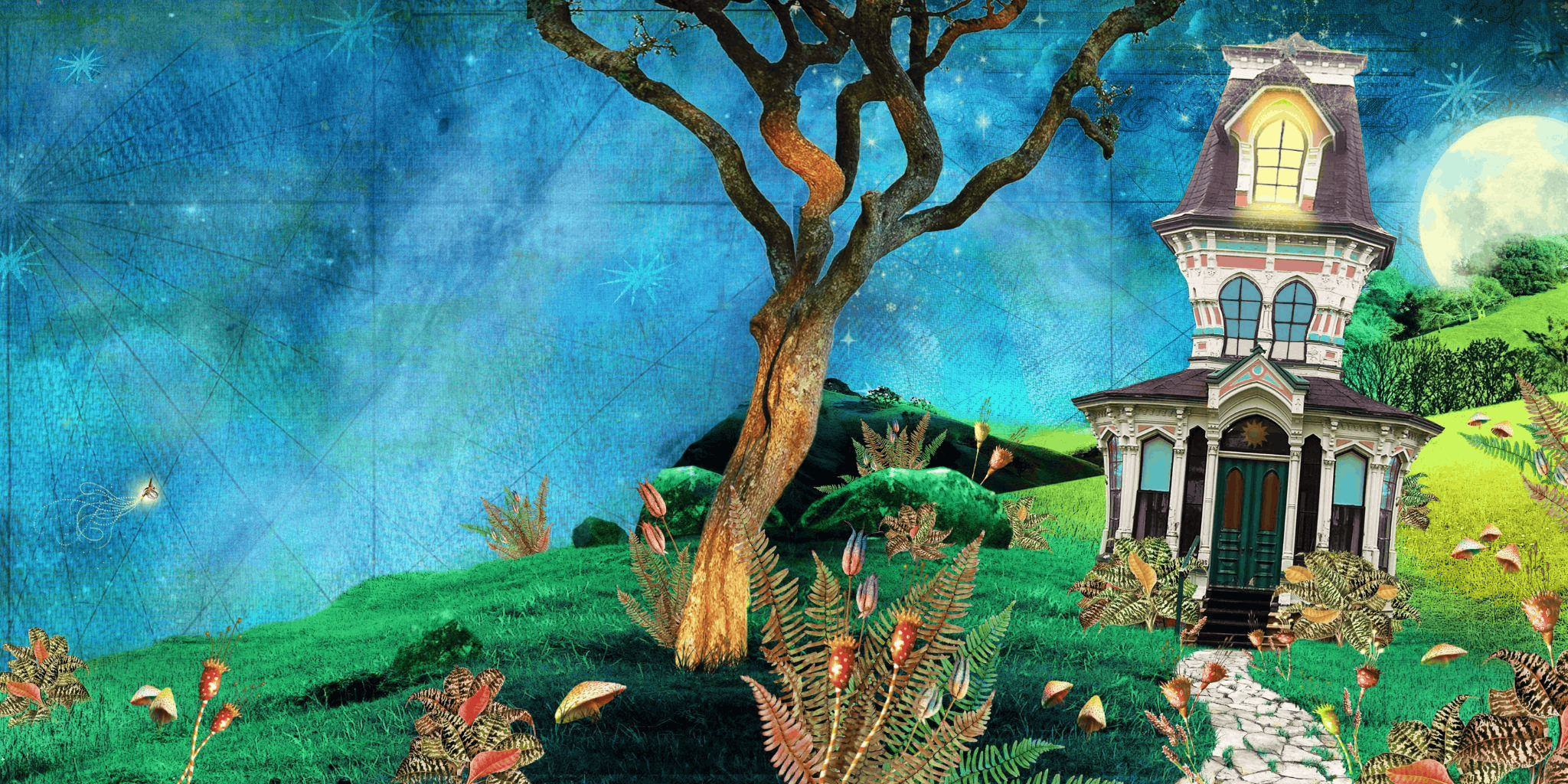
1. Watercolor
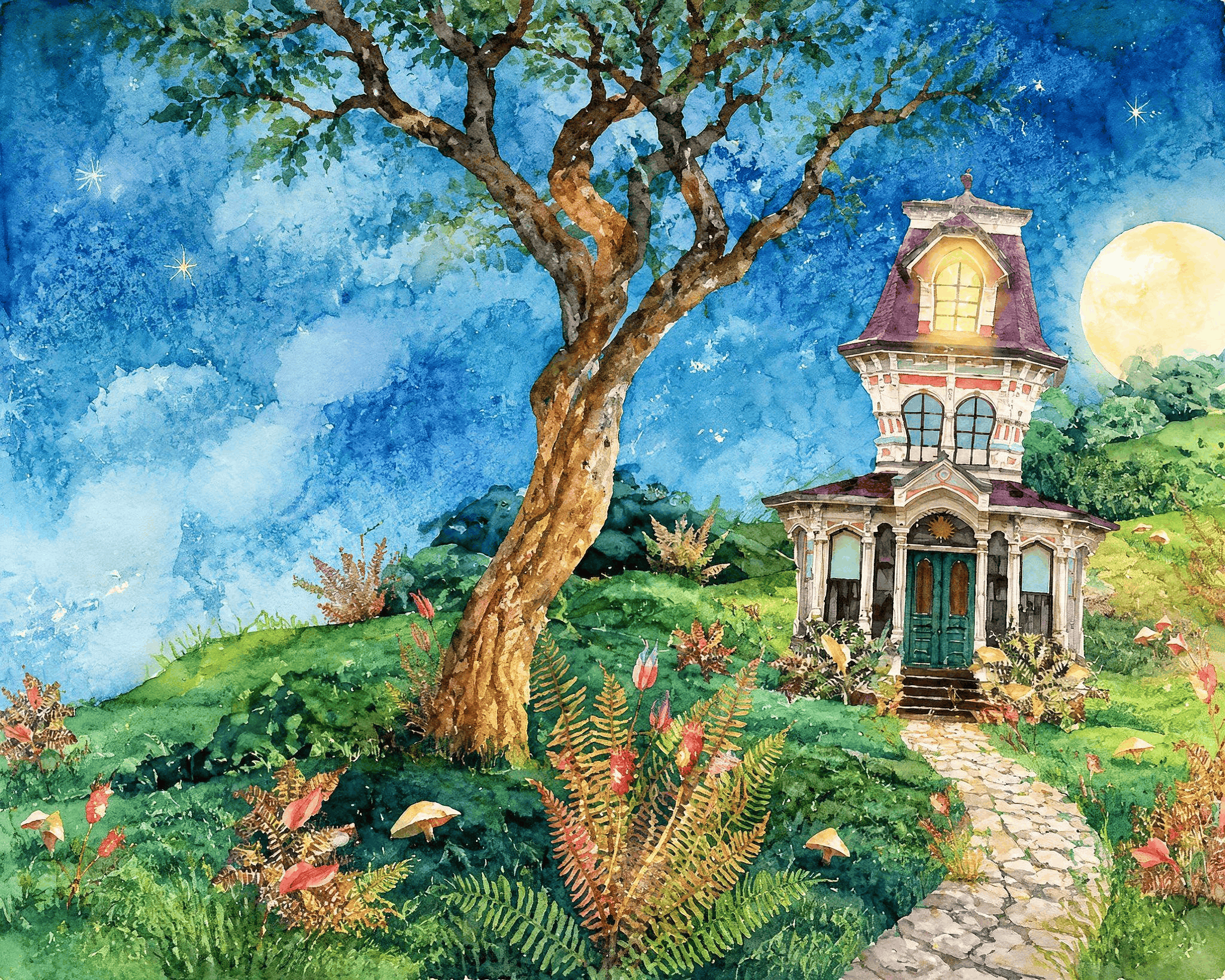
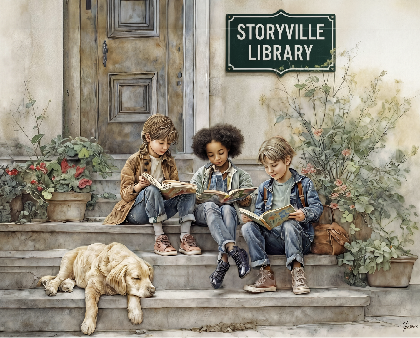
Soft edges, transparent washes, and color that blooms into the white of the page. Watercolor feels gentle and a little nostalgic, which is why it shows up so often in bedtime books and stories about nature, family, and quiet moments. Beatrix Potter's Peter Rabbit books are the classic example.
Best for: bedtime stories, nature, gentle emotional stories, ages 4–8.
Watch out for: low contrast. Pale washes can look muddy in print.
[IMAGE: Original scene from “Sunbelievable,” rendered in AI-assisted watercolor effect]
2. Cartoon and line art
Clean outlines, simplified shapes, and expressive faces. Cartoon style is fast to read and great for humor, which is why so many funny picture books and early readers use it. Mo Willems' Elephant & Piggie books show how much feeling a few simple lines can carry.
Best for: humor, early readers, books built on dialogue and big reactions.
Watch out for: a generic "clip art" look.
3. Collage and cut paper
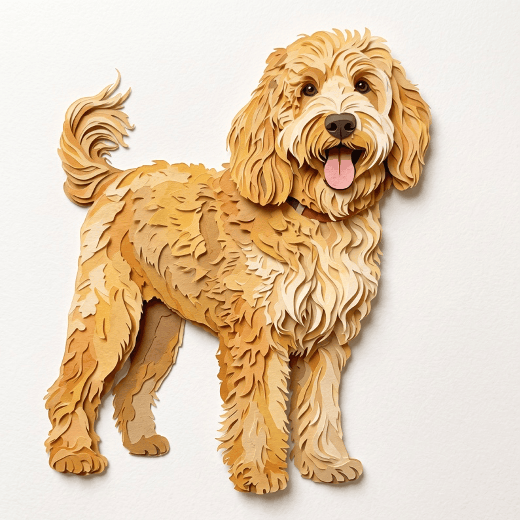
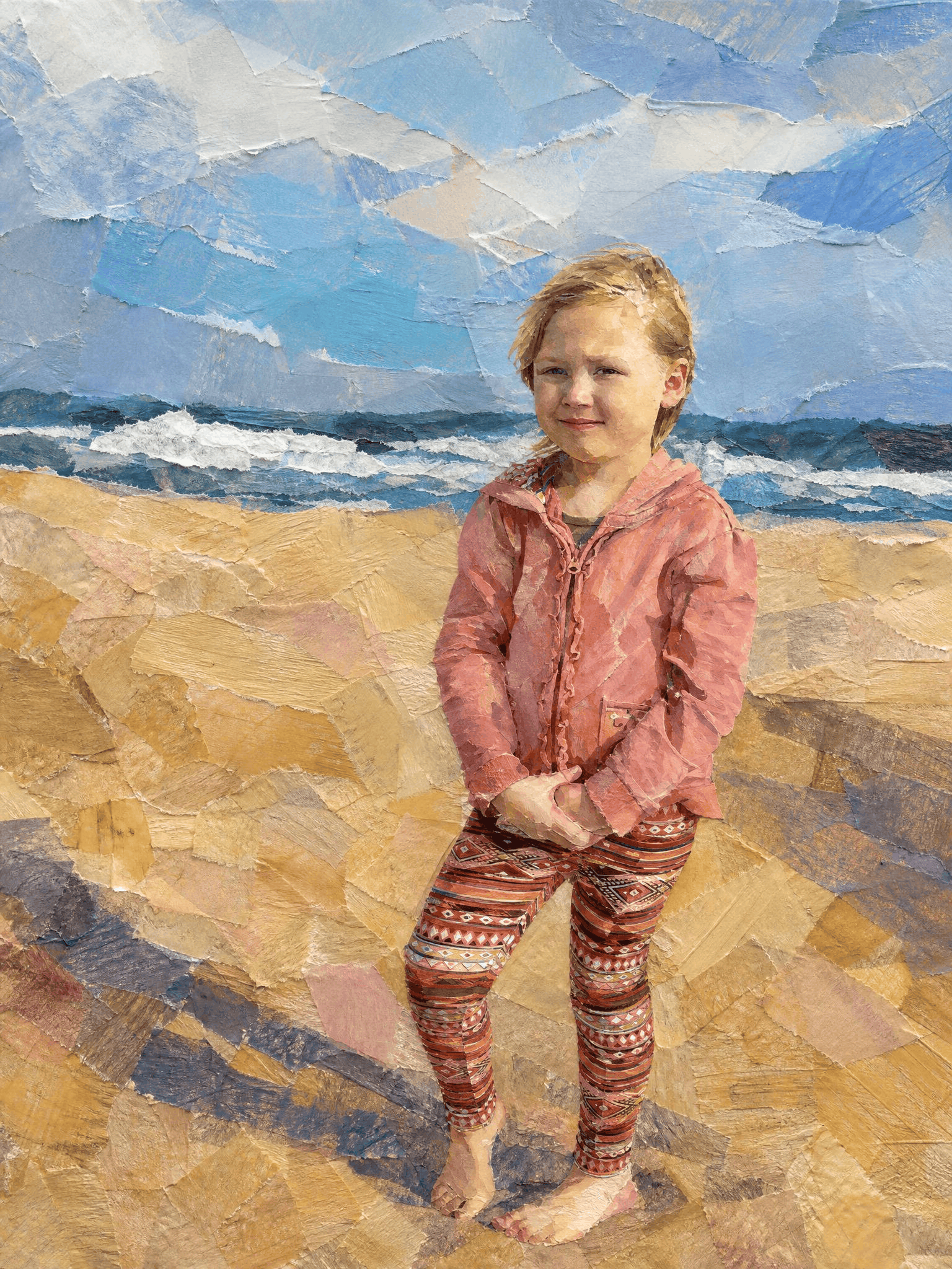
Torn paper, painted tissue, fabric, and found textures layered together. Collage feels tactile, like you could reach in and touch the page. Eric Carle's painted tissue-paper collage in The Very Hungry Caterpillar and Ezra Jack Keats' The Snowy Day made this style iconic.
Best for: concept books (colors, counting, seasons), bold simple stories, toddlers.
Watch out for: busy, complex compositions.
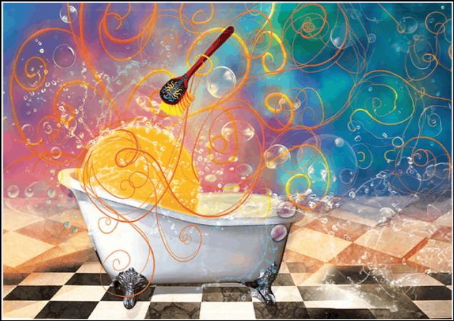
4. Painterly digital
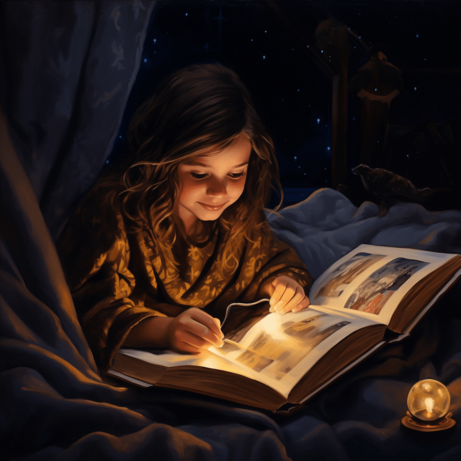
Digital painting in Photoshop or Procreate that mimics oils, gouache, or acrylics, with rich color, soft lighting, and visible brushwork. This is where I spent most of my first decade as an illustrator, often starting from photographs and painting them into picture book scenes. It can look warm and traditional while staying easy to revise.
Best for: character-driven stories, emotional stories, books with lots of lighting and mood.
Watch out for: over-rendering. Too much detail can make a scene feel stiff instead of storybook.
5. Flat vector and graphic
Bold shapes, solid color, minimal texture, often made in Illustrator or similar tools. Flat graphic styles feel modern and clean, and they reproduce crisply at any size.
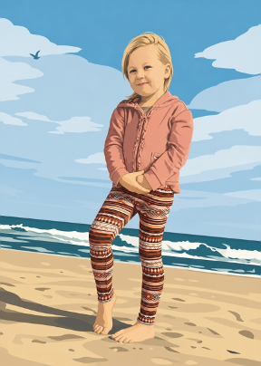
Best for: concept books, nonfiction for kids, modern design-forward stories.
Watch out for: coldness. Add a little texture or hand-drawn imperfection to keep warmth.
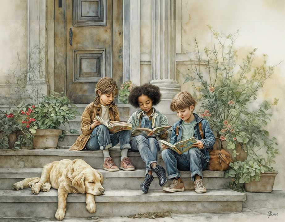
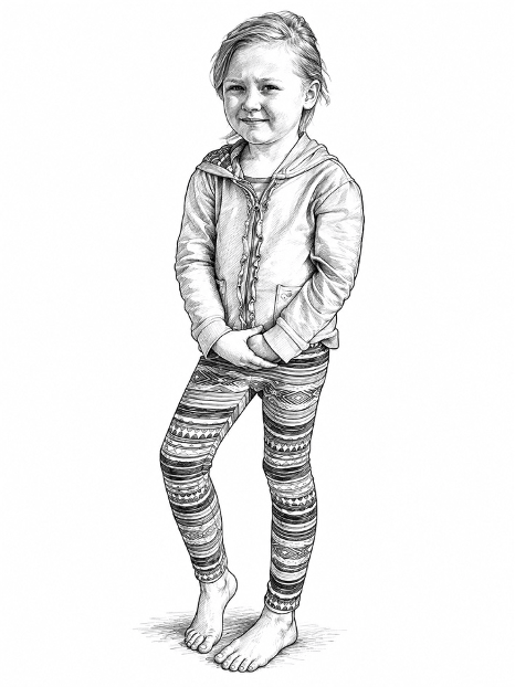
6. Color pencil drawing
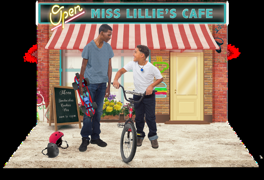
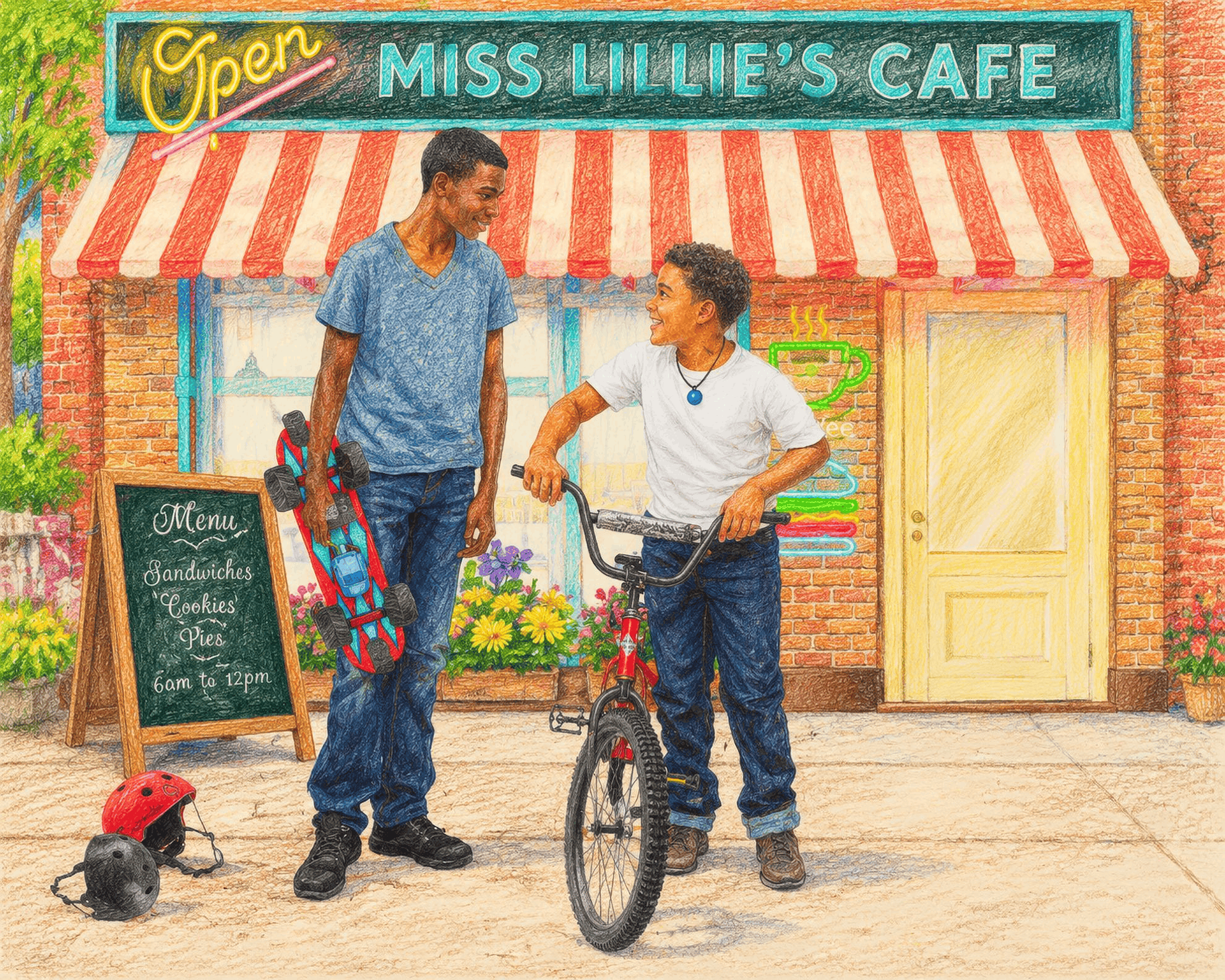
This is one of my favorite illustration styles for fine detail and rich colors that pop off the page. I created the first image below in Photoshop using the author’s photographs of family members. For this article, I used AI to create the color pencil drawing version that follows, where you can readily see the vibrant colors, additional depth, and visual dimension.
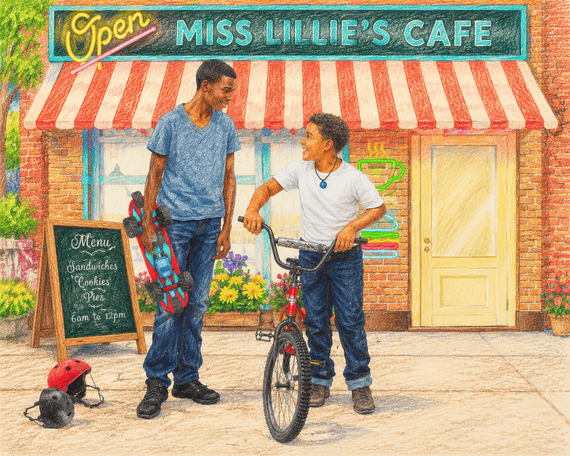
Best for: older picture books, mysterious or dramatic stories, chapter book spot illustrations.
Watch out for: too much detail for the youngest readers, who respond to simpler, high-contrast images.
7. Realistic and semi-realistic
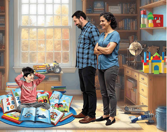
Accurate anatomy, believable lighting, and lifelike detail. Realism works when the story is grounded in the real world: animals, history, science, or a real family.
Best for: nonfiction, animal stories, historical stories, memoir picture books.
Watch out for: the "uncanny" zone. Faces that are almost real but not quite can feel unsettling to kids.
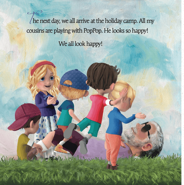
These images were created initially in Photoshop, then rendered in AI to achieve character consistency throughout the author’s story.
8. 3D and animation-inspired

Rounded forms, soft lighting, and the polished look of an animated film. Kids recognize it instantly from the movies and shows they watch.
Best for: adventure, fantasy, stories with lots of movement and big expressions.
Watch out for: sameness. Many self-published books use this look now, so it takes extra care to stand out.
9. Mixed media
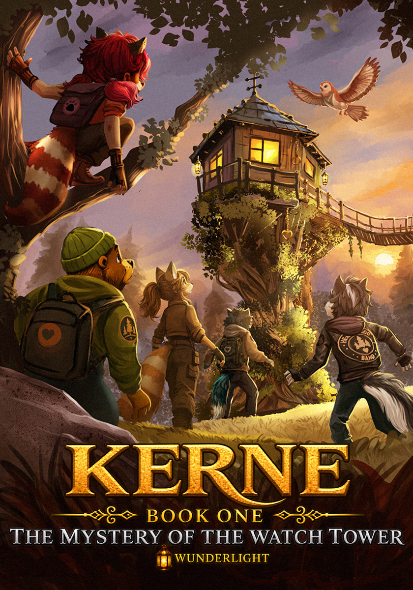
Any combination of the above: painted backgrounds with cut-paper characters, pencil linework over digital color, photographs blended with paint. Mixed media is where many illustrators find their signature look.
Best for: almost anything, once you know what each layer is doing for the story.
Watch out for: a muddle. Mixing works when it's a deliberate choice, not an accident.
How to Choose the Right Illustration Style for Your Book
There's no "best" style, only the one that best serves your story. When I coach authors through this choice, we work through five questions.
- Who is your reader? Board books for toddlers need simple shapes, bright color, and high contrast. Picture books for ages 4–8 can carry more detail and subtler color. Chapter books often need only black-and-white spot illustrations.
- What is the mood? Say your story's feeling in one word: cozy, silly, brave, curious, tender. Watercolor leans cozy and tender. Cartoon leans comical. Painterly and pencil styles can carry drama and wonder.
- How central are your characters? If one character appears on every spread, pick a style you (or your illustrator) can repeat consistently for 32 pages. Simpler styles are easier to keep consistent than highly rendered ones. But you may want to try AI, which excels at character consistency.
- Who is making the art? If you're illustrating your own book, choose a style that fits your current skills and tools, then grow from there. If you're hiring, look for an illustrator whose existing portfolio already looks like the book you're picturing.
- What's already on the shelf? Visit the library section where your book would live. You want to fit the category and still stand out within it.
A quick exercise I give every author: pull ten picture books you love, photograph one spread from each, and lay them out together. Circle what they have in common. That's usually the style you've been drawn to all along.
For the full step-by-step process from manuscript to print-ready files, see How to Illustrate a Children's Book.
Choosing a Style Is Easy. Keeping It for 32 Pages Is the Real Work.
The biggest style problem I see in self-published books isn't a bad choice. It's drift. The character's face changes from page 4 to page 12, the palette slides from warm to cool, and the brushwork looks like three different artists made it.
A few habits keep a style steady from cover to back page:
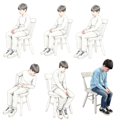
- Make a character reference sheet, also known as a design sheet, with AI tools before you illustrate any spreads: front, side, and back views, plus a few key expressions.
- Lock in your palette. Pick 6–10 core colors and save them as swatches. Add accent colors on purpose, not by accident.
- Write down your style rules. How you use colors, shadows, how much background detail. One page is enough.
- Review spreads side by side, so you can spot drifts from your original image concept. Drift only shows up when you see pages together.
Where AI Fits (and Where It Doesn't)
I'll be honest about my own process. AI tools like Midjourney, Magnific, and OpenArt are wonderful for exploring styles. You can generate characters quickly in numerous styles, such as watercolor, collage, and painterly digital, before committing to one direction. That used to take weeks of iterations in Photoshop.
But I frequently still go into Photoshop for refinement, lighting, and the small details that make 32 pages feel like one book. AI for discovery, Photoshop for precision. However, AI images can be so good that if you’re considering AI tools to create illustrations, you won’t necessarily need Photoshop to achieve professional, high-quality images for a beautiful, artful picture book.
If you're weighing the two approaches, I go deeper in AI vs. Traditional Illustration for Children's Books. And for the craft lessons that matter in any style, see what a decade of practice actually taught me.
Find the Look That Brings Your Story to Life
Your illustration style is the first thing a reader meets, before the title and before your first sentence. It's worth taking the time to get right, and it's much easier when someone who has been there helps you test ideas and hold the line across every page.
If you're not sure which style fits your story, that's exactly what we sort out in a first coaching session. Book a free call and bring your manuscript. We'll look at your story together and map out the look that brings it to life.
Want to learn more about how I work with authors? See my children's book author coaching.
Frequently Asked Questions
What is the most popular children's book illustration style?
There's no single winner. Cartoon, watercolor, and painterly digital styles are among the most common, and many books blend several styles. Illustration styles appeal to different age groups, so keep this in mind when exploring which styles are best suited for your story.
Can I mix illustration styles in one book?
Yes, as long as the mix is deliberate and stays the same from page to page. Mixed media is a style of its own.
How do I find my own illustration style?
Collect spreads from books you love, notice what they share, then experiment with those elements. A style usually emerges after a lot of exploring and repetition, not in one sitting.