
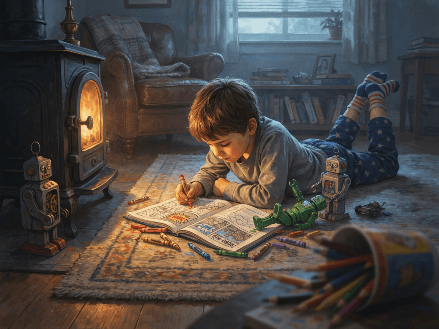
Drawing matters, but it is not where a picture book begins, and it is not the reason most first books fall apart. After illustrating more than a dozen children's books and coaching authors through their own, I can tell you the ones that work were planned as books before a single finished illustration existed. The ones that struggle were assembled image by image, beautifully, in the wrong order.
So, this is the process I actually use, start to finish — the same one I walk authors through one-on-one. It assumes you are illustrating your own story, that you may not have a formal art background, and that you want to end up with something you can print and be proud of.
A quick note on who's telling you this: I've illustrated and coached authors through picture books for over a decade, with honors from Mom's Choice, Foreword Indies, and coverage in USA Today. What follows is my working process; not a checklist pulled together from research.
Step 1: Break Your Story into Spreads Before You Draw Anything
A picture book is not a collection of pictures. It is a fixed physical object with a fixed number of pages, and that number is almost always 32.
That is not a stylistic choice — it comes from how books are printed. Pages are printed on large sheets and folded, so the total must be a multiple of eight. Thirty-two is the standard for picture books; 24 and 40 also exist.
Once you subtract front matter — title page, copyright page, sometimes a dedication — you are usually working with about fourteen double-page spreads for the actual story.
Before you illustrate anything, print your manuscript and cut it into fourteen sections. Decide which words belong on each spread, then look closely at what happens just before every page turns. The end of a spread should create curiosity, tension, surprise, or momentum, giving the reader a clear reason to keep going. That page-turn effect is what pulls readers naturally through the story.
This is the single most useful hour you will spend on your book, and almost nobody does it first. You will immediately discover that your story is unevenly paced — that three pages of setup are competing for one spread while your climax has nowhere to breathe. Better to find that now than after you have illustrated twenty pages.
Step 2: Build a Dummy Book
Take eight sheets of paper, fold them in half, and staple the fold. That is your book.
Write your spread-by-spread text into it in pencil. Sketch nothing yet, or sketch badly — stick figures are fine. What you are testing is whether the story turns properly.
Read it out loud, turning the pages as you go. You will feel where it drags. You will feel where a page-turn lands with a small jolt of surprise and where it lands with nothing.
That physical dummy will tell you more about your book than any amount of thinking about it will. I still make one for every project.
Step 3: Design Your Main Character Before You Design Anything Else
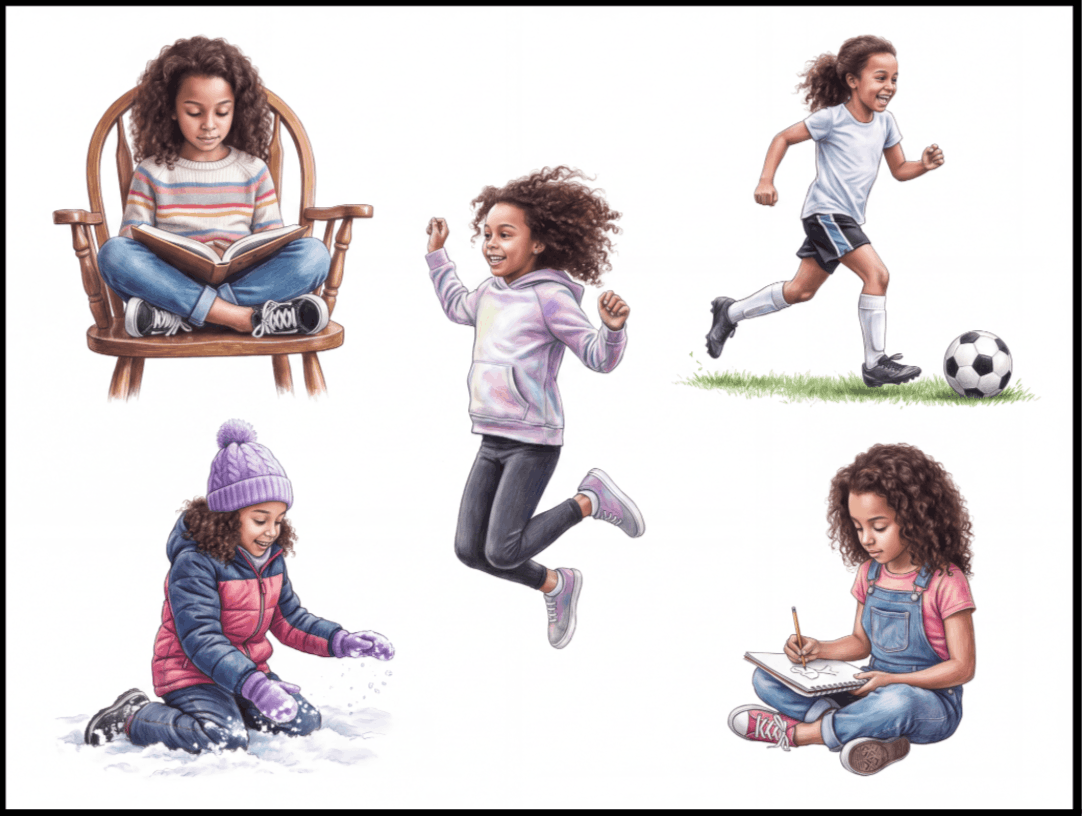
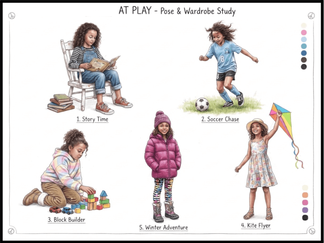
Nothing pulls a young reader out of a story faster than a character who looks slightly different from page to page. A hairline that shifts, a shirt that changes shade, a nose that grows — children notice all of it, even when adults don't.
Getting a face, a hairstyle, an outfit, and a posture to hold steady across thirty-two pages, in different poses and different light, is genuinely difficult. It is also the skill that separates a finished, professional-feeling book from one that reads as amateur, no matter how lovely any single illustration looks on its own.
So, before you illustrate a single scene, build a character reference sheet: your character from the front, the side, and the back; happy, worried, delighted, asleep; standing, running, sitting. Pin it up where you can see it.
If you are working with AI tools, this is where they genuinely help. I use the character-modeling features in Magnific and OpenArt to generate reference sheets, then use those sheets as the anchor for every subsequent image. But the reference sheet itself matters more than how you make it — I built these by hand in Photoshop for ten years before AI existed, and the discipline is identical.
Step 4: Choose a Style You Can Actually Sustain
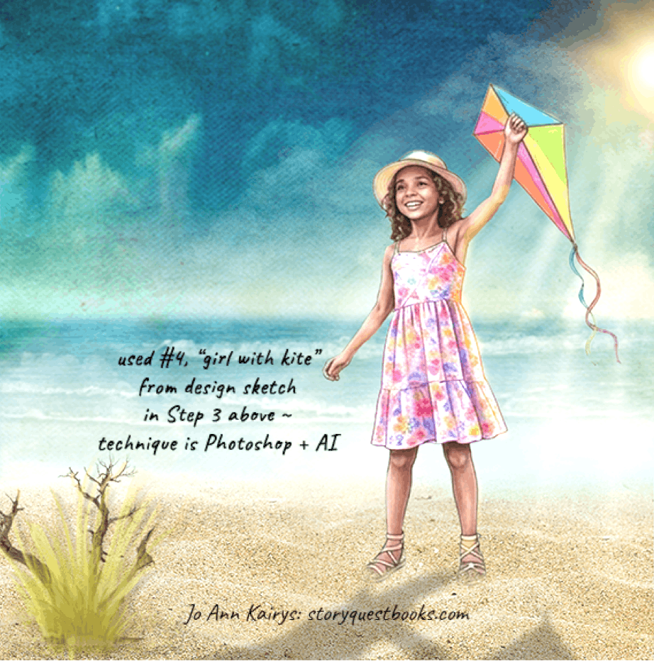
Authors often pick a children's book illustration style from a book they love without asking the harder question: Can I do these fourteen more times, consistently, without burning out?
Some honest guidance on the common styles:
- Watercolor and soft paint. Warm, classic, forgiving imprecision. Hard to keep consistent across a full book because every wash behaves a little differently.
- Flat vector. Clean, modern, extremely consistent, and much faster once your character is built. Less texture and atmosphere.
- Digital painting. The most control and the most range, but also the steepest learning curve.
- Collage and mixed media. Distinctive and memorable, genuinely hard to reproduce across thirty-two pages.
- Photographic and hybrid. My own background — I spent a decade transforming photographs into picture book art, layer by layer, in Photoshop. These days, my workflow almost always includes an AI-generated exploration of artistic styles, or precise refinement of image details, such as lighting effects, character features, and background consistency.
Pick the style you can finish. A consistent book in a simple style beats an inconsistent book in an ambitious one, every time.
Step 5: Thumbnail Every Spread
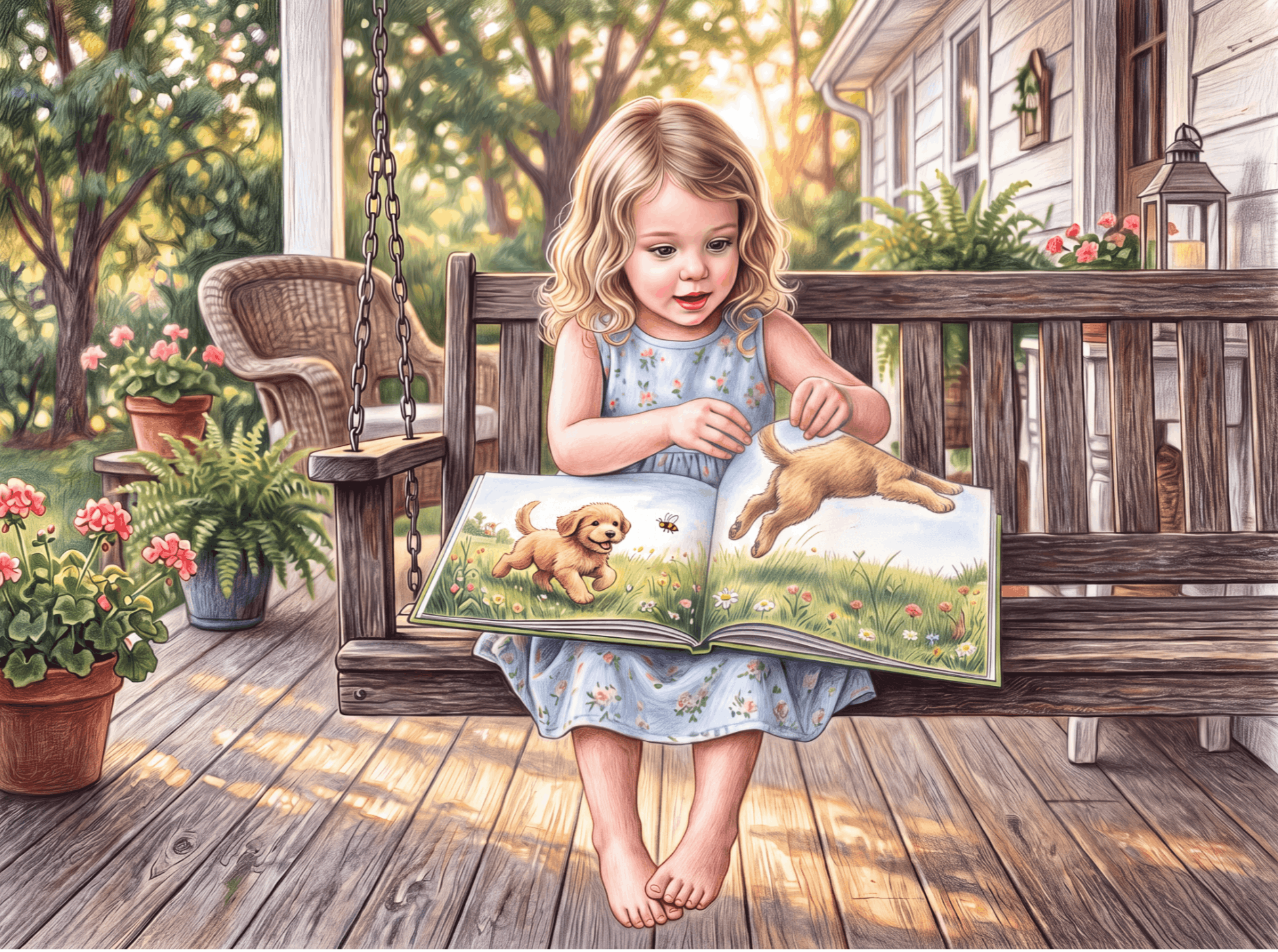
Now sketch — small and fast. Two inches wide, thirty seconds each, no detail. AI can be a valuable tool for this purpose.
Thumbnails are where you make composition decisions cheaply. Where is the character on the page? Where does the eye enter the spread, and where does it exit? Is there room for the text, and does the text sit somewhere that doesn't fight the art?
And here is the mistake I see constantly: illustrations that simply repeat what the words already say. If the text tells us the dog ran away, why would the picture show us the dog running away? Show us what the words didn't. Where did the dog go? What does the child's face look like, watching it disappear?
That gap between what is written and what is drawn is where picture book storytelling actually happens. Thumbnails are cheap enough that you can try five versions of a spread before committing.
Step 6: Sketch, Then Line, Then Color — In That Order
Work the whole book through each stage before moving to the next. Do not finish spread one completely and then start spread two.
- Full-size sketches for all fourteen spreads. Refined thumbnails — real proportions, real composition, still rough.
- Line work or base shapes across the whole book.
- Color across the whole book.
- Final detail and polish, last.
The reason is consistency. If you polish page one before moving on, your skills keep improving as the book progresses, and the early pages can start to look out of step with the later ones. Working in horizontal passes keeps the whole book developing at the same level. It also helps you spot a drifting character, lighting choice, or style decision before you have repeated the mistake across a dozen spreads. I learned this the hard way in Photoshop, getting absorbed in one dramatic lighting effect only to realize it would not work for the pages that followed. That kind of detour costs valuable time.
Step 7: Use Color to Carry the Emotion
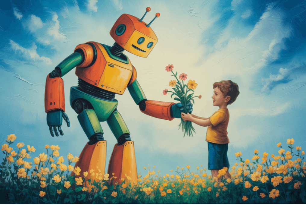
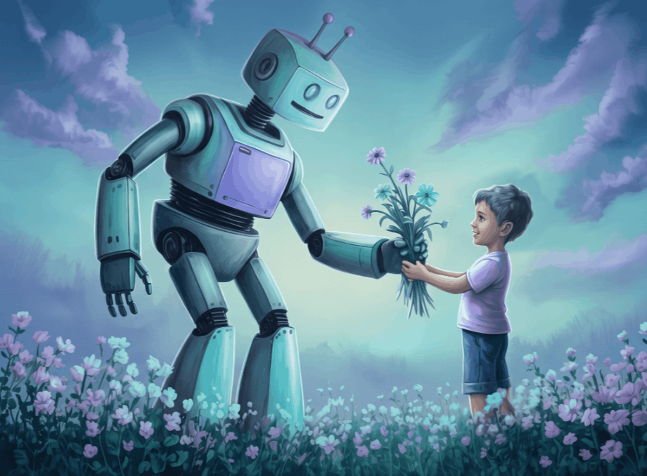
Children respond to color before they respond to almost anything else on a page, and I don't think this gets talked about enough.
A warm, golden palette tells a very young reader that a scene is safe before they have processed a single detail of what's happening in it. A cooler, more muted palette signals something is wrong long before the words confirm it.
Build a palette for the whole book, not per page. Decide early where the warmest and coolest moments sit and let the middle spreads move between them. Color is part of the storytelling, sitting right alongside the words — not a decoration applied at the end.
Step 8: Match Complexity to Your Reader's Age
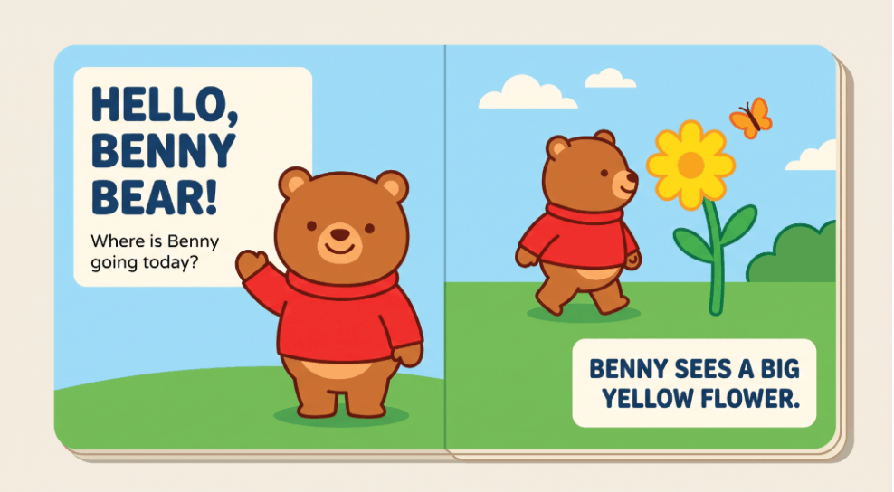
A board book for toddlers wants simple, bright, high-contrast scenes a small child can read quickly, even without words. Books for older readers can carry more texture, depth, and detail.
An intricate, highly detailed spread may be entirely lost on a two-year-old who just wants to know: is the puppy okay?
Decide who this book is for and let that decide how much goes on the page.
Step 9: Check Consistency Across the Whole Book
.png)
Lay every spread out where you can see them all at once — printed, on the floor, or in a grid on screen.
Then check, deliberately:
- Does the character look like the same person on every page?
- Do clothing, hair, and props stay consistent unless the story changes them?
- Does the palette hold together, or does one spread jump out?
- Does light come from a consistent direction within each scene?
- Does the eye move through the book, or does one spread stop it dead?
I do this every single time, and I have never once done it without finding something. There is no shortcut that replaces a human eye checking one page against every other page.
Step 10: Prepare Print-Ready Files
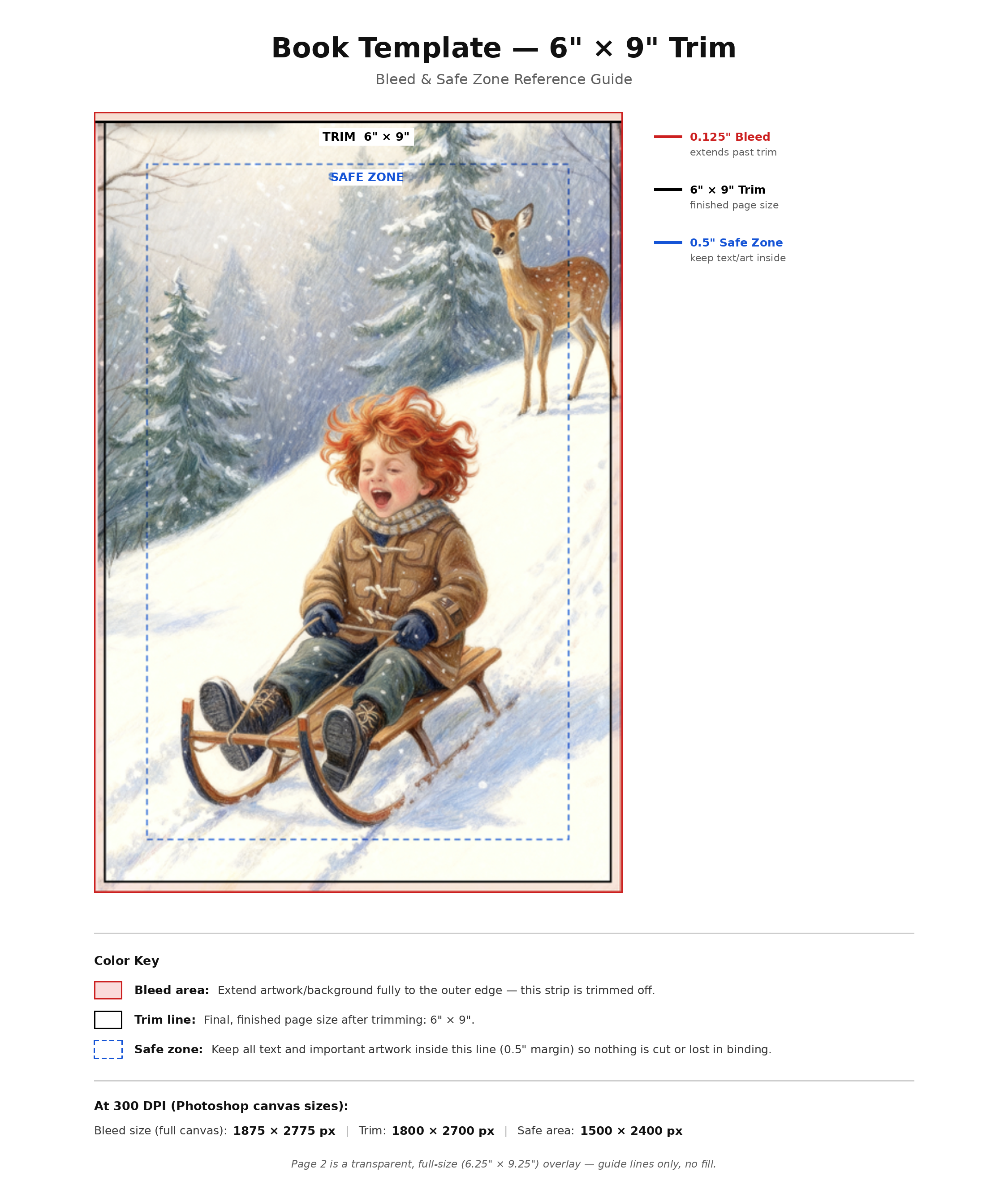
This is where I see more self-publishing authors get stuck than anywhere else, and it's the least-discussed part of the whole process.
- Resolution: 300 DPI at final print size. Not 72. Screen-resolution art looks fine on your monitor and is soft and disappointing in print. Set this before you start illustrating, not after.
- Color mode: CMYK for print. CMYK is required by most printers. Your art was almost certainly made in RGB, and RGB can display colors that ink physically cannot reproduce. Bright oranges and deep blues shift the most. Convert and review before you commit — colors will change, and you want to be the one deciding how.
- Order a physical proof. Always. Computer screens can miscalculate color unless calibrated.
Book Printing Template
- Bleed. If art runs to the edge of the page, extend it about 0.125" beyond the trim line on every outside edge. Without bleed you get white slivers where the cut wasn't perfect.
- Trim and safe margins. Keep anything important — faces, text, a character's hands — well inside the trim line. Cutting is not precise to the millimeter.
- Gutter. The center fold eats part of a double page spread. Never put a face or a critical detail in the gutter.
Your printer will publish exact specs. Get them before you finish your files, not after.
Step 11: Know When It's Finished, Not Just Pretty
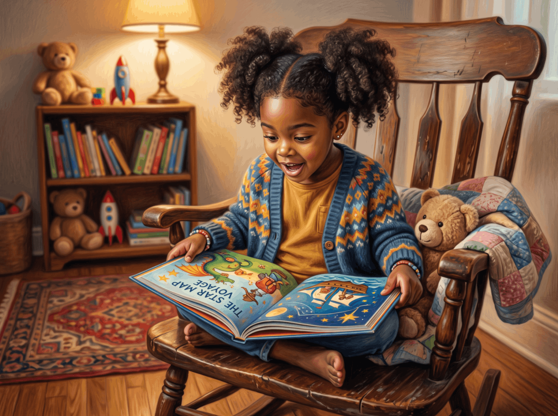
Here is the thing I most want a self-publishing author to understand: an illustration can be technically well-executed and still fail the book.
It can have beautiful color and a distinctive style and still not work, because it didn't move the story forward, or didn't present the character consistently, or didn't consider who is actually going to be looking at it.
That is the real skill — asking, on every page: does this look good, and does it do its job?
What I Actually Use
For transparency, since people ask:
- Adobe Photoshop — my primary tool for over a decade and still use often in combination with other digital tools; especially efficient these days with Firefly AI built into Photoshop.
- My go-to, AI-assisted illustration tools: Magnific, OpenArt, Midjourney, Firefly — fast and great for exploring illustration styles, artistic effects, character models (anime, photorealistic, cartoon, human, etc.); exceptional for image consistency across multiple pages and scenes.
- A physical dummy book — paper, folded and stapled. Still the most useful tool I own.
If you are starting from nothing, Procreate on an iPad is the gentlest on-ramp for drawing, and Affinity Photo is a capable one-time-purchase alternative to Photoshop.
How Long This Takes
For a standard 32-page picture book, a first-time author-illustrator should plan on a minimum of several months of focused work, not weeks. This estimate is highly variable and dependent on multiple factors, such as the starting point (story concept, status of story narrative, time limiting factors, budget, etc.).
Character design and style decisions take longer than you expect. Consistency across a full book takes longer than you expect. The print file stage takes longer than you expect. Everyone underestimates all three, including people who have done it before.
Frequently Asked Questions
- Do you need to know how to draw to illustrate a children's book?
You need a willingness to practice more than a natural gift. Most of what makes an illustration work — page-turns, character consistency, color decisions, matching complexity to age — is craft you can learn deliberately. I've coached authors who started with no formal art background through their first fully illustrated book. - How many illustrations does a children's book need?
For a standard 32-page picture book, plan on roughly fourteen double-page spreads after front matter, plus a cover. Some spreads carry one large image and some carry several smaller ones — that's a pacing decision you can make in your dummy book. - How long does it take to illustrate a picture book?
Anticipate at the very least, several months of focused work for a first-time author-illustrator. Character consistency across a full book is one stage that most often takes longer than people plan for. - Should I illustrate my own book or hire an illustrator?
It depends on whether you want illustration to be part of your creative process or a task to hand off. If any part of you wants to learn, I'd encourage you to try — with the right guidance, it's more achievable than most first-time authors would likely guess. - What software should I use to illustrate a children's book?
Photoshop if you want maximum control and range. Procreate if you're drawing on an iPad and starting fresh. Affinity Photo if you want Photoshop-class capability without a subscription. The tool matters far less than the planning steps that come before you open it. - What resolution do children's book illustrations need to be?
300 DPI at final print size, in CMYK, with bleed on any art that runs to the page edge. Set this before you begin — upscaling screen-resolution art afterward does not recover the detail. - Can I use AI to illustrate my children's book?
You can, and I do use AI as part of my own process — but it doesn't replace the craft decisions in this guide. AI is genuinely good at character reference sheets and exploring compositions quickly; it's unreliable at consistency across thirty-two pages without a human checking every page. I've written a fuller comparison in AI vs. Traditional Illustration for Children's Books. - How do I choose a children's book illustration style?
Pick the one you can sustain for thirty-two pages. Flat vector is the most consistent and fastest; watercolor is warmest but hardest to hold steady; digital painting gives the most range and takes the longest to learn. A consistent book in a simple style beats an inconsistent book in an ambitious one.
If you're partway into your own book and stuck on any of this, that's exactly what I do — I offer one-on-one coaching for children's book authors, working through character design, style, and the full illustration process page by page. Or book a free coaching call — no pressure, just a real conversation about where you're stuck.